Fossil.com Homepage
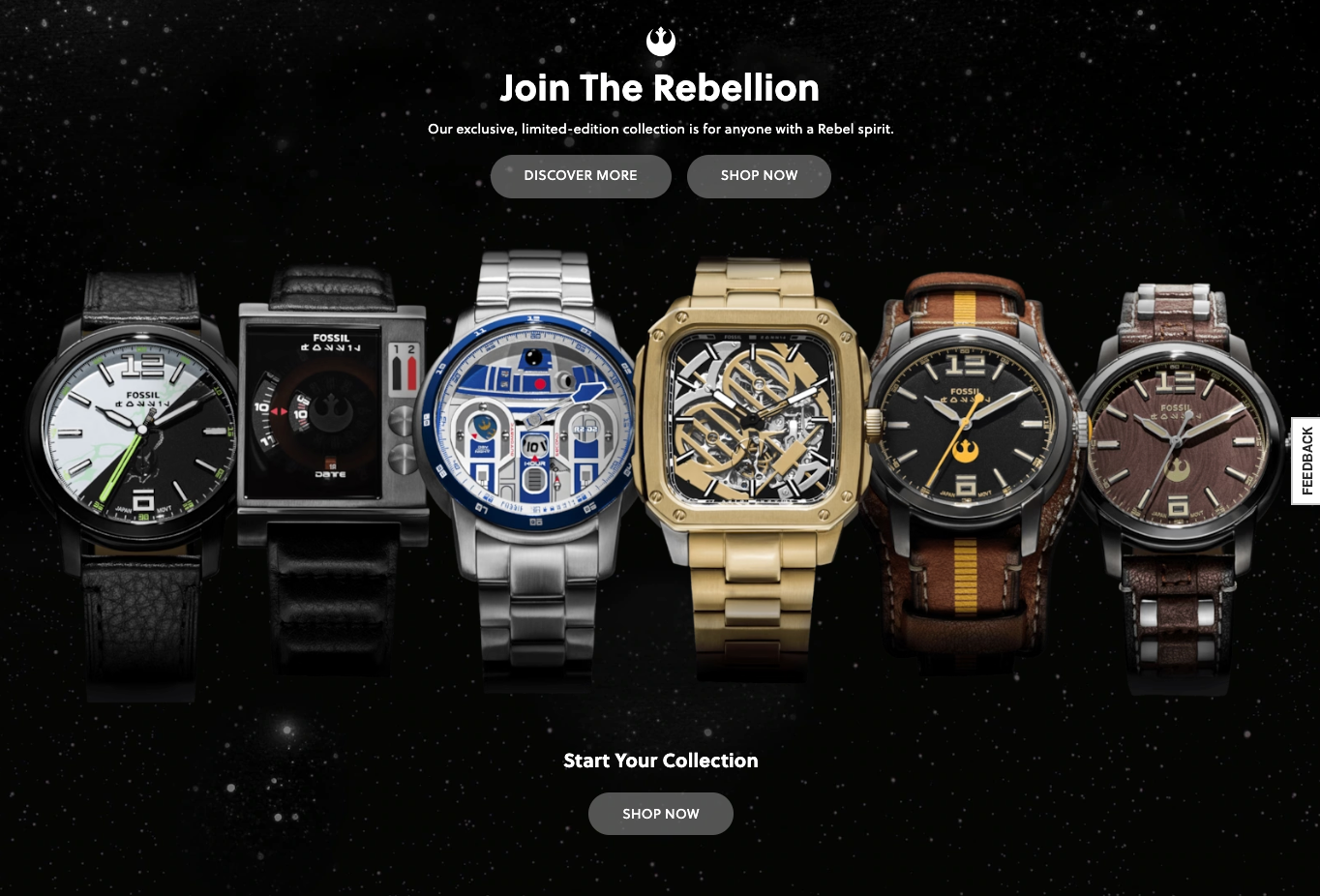
Less exciting than the slow scroll through the watches on mobile the site featured translucent ctas and a parallax background.
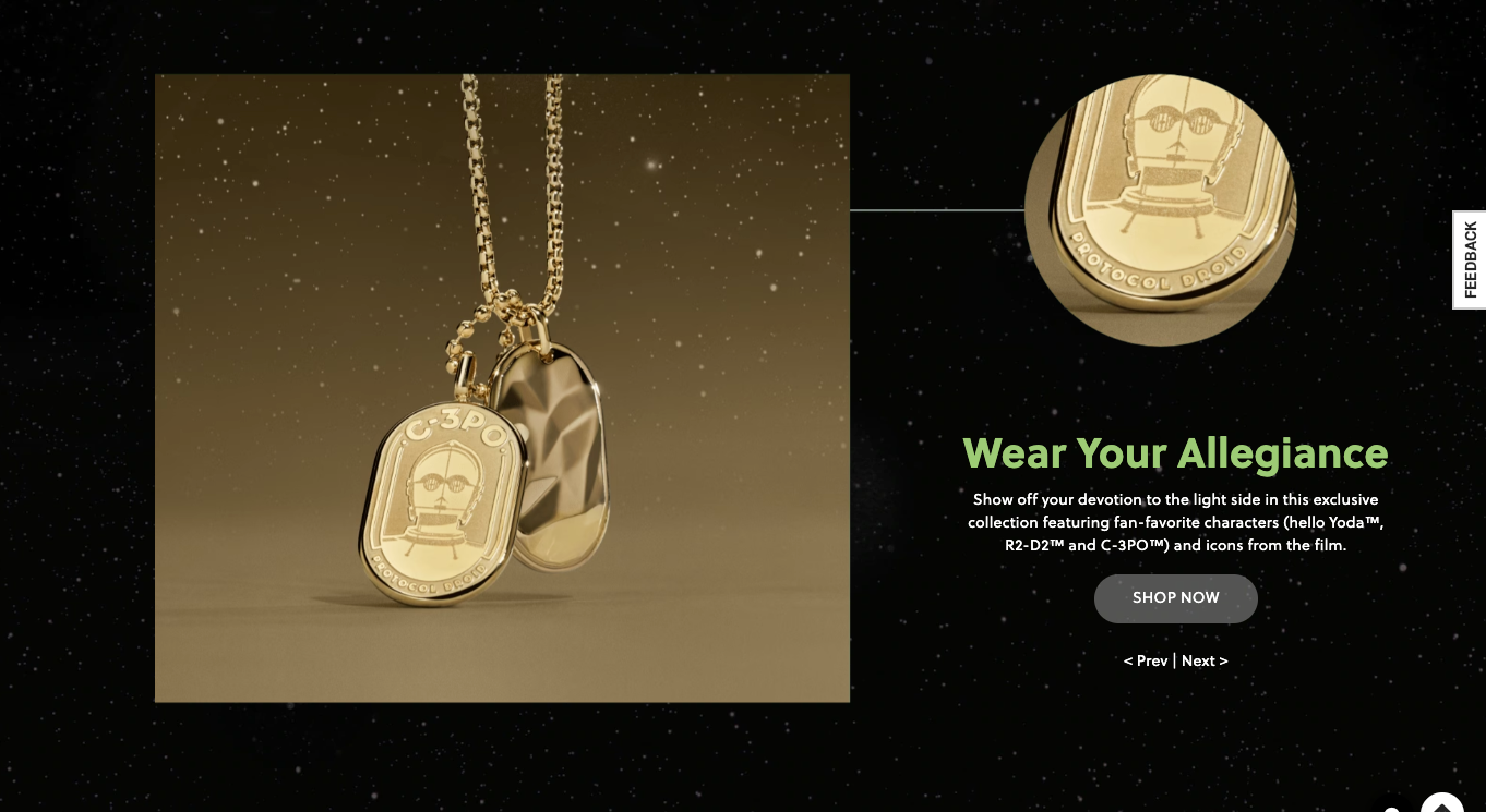
carouseled content allowed for users to flip through different pieces of jewelry found in the collaboration.
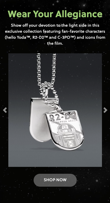
carouseled content allowed for users to flip through different pieces of jewelry found in the collaboration.

mobile view has an auto-scrolling carousel through the six limited edition watches in the collection.
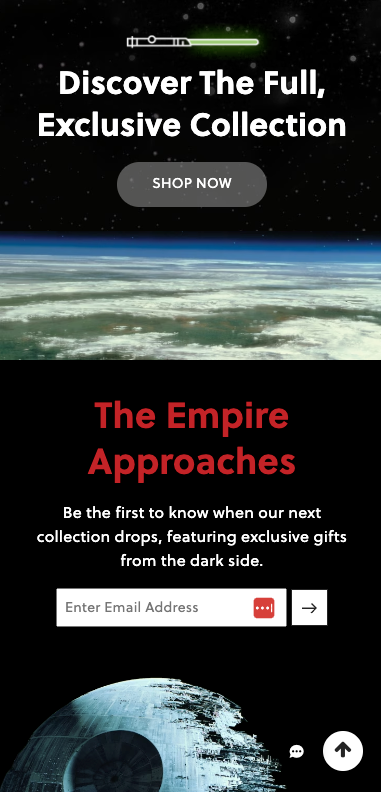
An animated lightsaber can be seen at the bottom of the page as well as the signup for. All of this is over a parallax starfield bg.
Fossil.com Featured Page
Hero banner - image Distortion caused by animated starfield background when a screenshot was captured
(animated starfield programmed by a colleague)
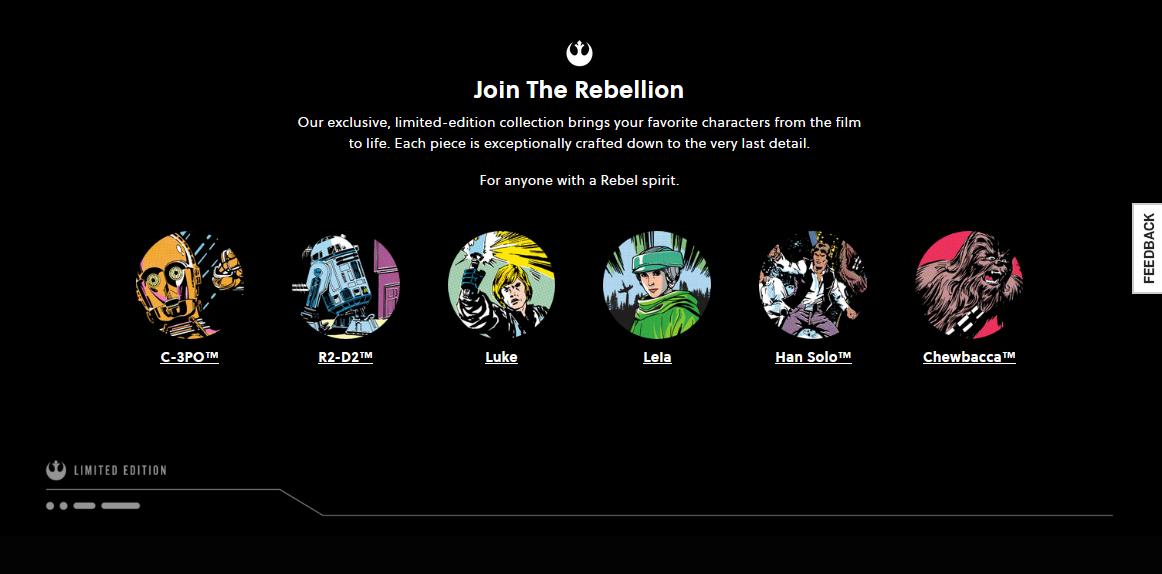
Anchor links allow user to navigate directly to the watches of the limited set.

Each watch has a hero banner with a mouseover structure to select particular features of each watch.
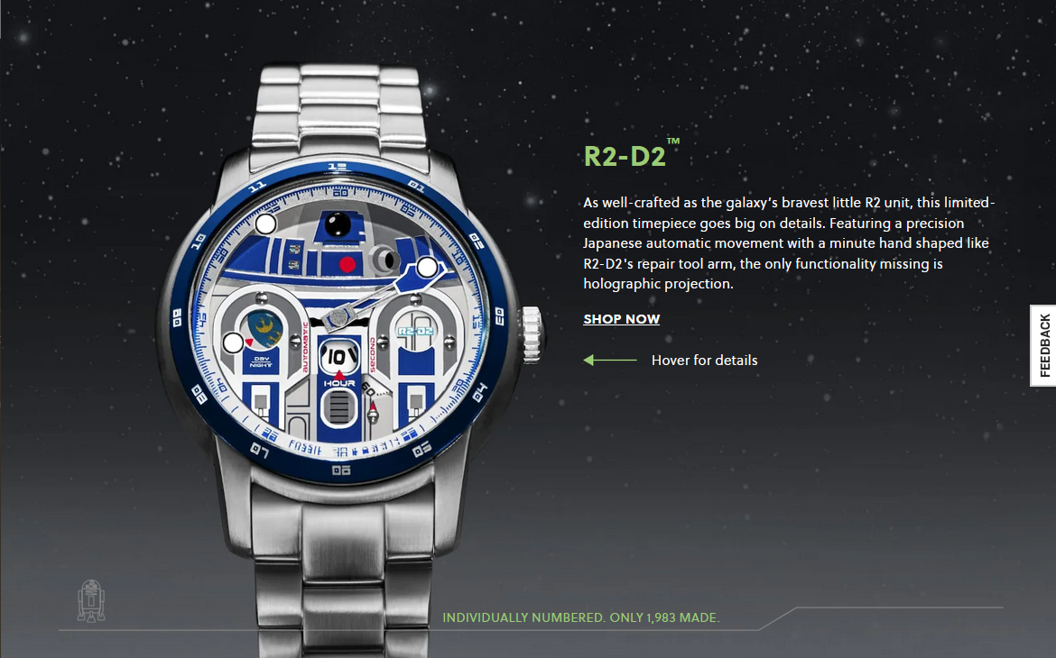
Each watch hero was a set of multiple layers, each interacting on different levels.
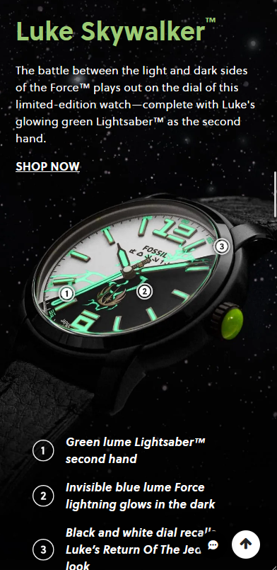


Fossil.com PDP assets

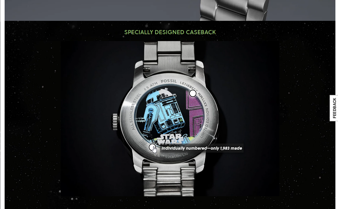
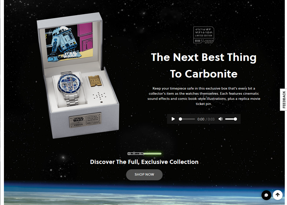


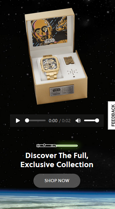
Fossil.com integrated content
Pieces of integrated content that were developed to be set on product landing pages.